Alegreya SC Font Family
20 downloads
License
SIL Open Font License
Uploaded on 30 January, 2026
Styles
10 styles included
-
AlegreyaSC-Regular.ttf

-
AlegreyaSC-Italic.ttf

-
AlegreyaSC-Medium.ttf

-
AlegreyaSC-MediumItalic.ttf

-
AlegreyaSC-Bold.ttf

-
AlegreyaSC-BoldItalic.ttf

-
AlegreyaSC-ExtraBold.ttf

-
AlegreyaSC-ExtraBoldItalic.ttf

-
AlegreyaSC-Black.ttf

-
AlegreyaSC-BlackItalic.ttf

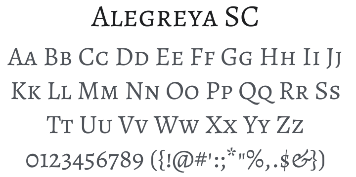
About Alegreya SC
Alegreya was chosen as one of 53 "Fonts of the Decade" at the ATypI Letter2 competition in September 2011, and one of the top 14 text type systems. It was also selected in the 2nd Bienal Iberoamericana de Diseño, competition held in Madrid in 2010.
Alegreya is a typeface originally intended for literature. Among its crowning characteristics, it conveys a dynamic and varied rhythm which facilitates the reading of long texts. Also, it provides freshness to the page while referring to the calligraphic letter, not as a literal interpretation, but rather in a contemporary typographic language.
The italic has just as much care and attention to detail in the design as the roman. The bold weights are strong, and the Black weights are really experimental for the genre. This is the Small Caps sister family that complements Alegreya, the main family.
Not only does Alegreya provide great performance, but also achieves a strong and harmonious text by means of elements designed in an atmosphere of diversity.
The Alegreya type system is a "super family", originally intended for literature, and includes serif and sans serif sister families.
Designed by Juan Pablo del Peral for Huerta Tipográfica.
Related Categories
Similar Fonts
View All →