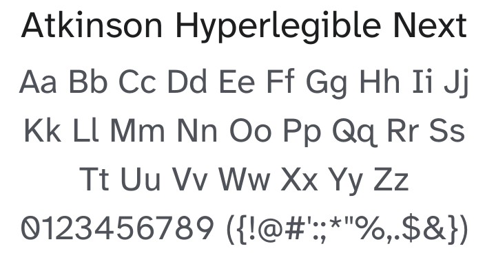
Atkinson Hyperlegible Next Font Family
25 downloads
License
SIL Open Font License
Uploaded on 24 February, 2026
Styles
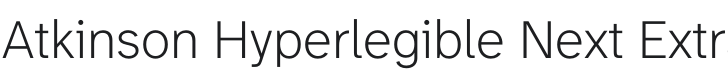
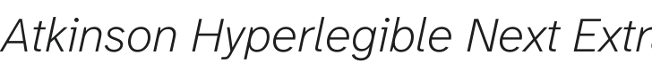
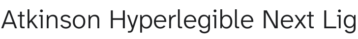
14 styles included
-
AtkinsonHyperlegibleNext-Regular.otf

-
AtkinsonHyperlegibleNext-Bold.otf

-
AtkinsonHyperlegibleNext-BoldItalic.otf

-
AtkinsonHyperlegibleNext-ExtraBold.otf

-
AtkinsonHyperlegibleNext-ExtraBoldItalic.otf

-
AtkinsonHyperlegibleNext-ExtraLight.otf
-
AtkinsonHyperlegibleNext-ExtraLightItalic.otf
-
AtkinsonHyperlegibleNext-Italic.otf

-
AtkinsonHyperlegibleNext-Light.otf
-
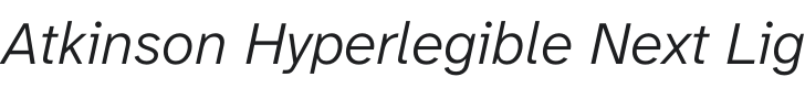
AtkinsonHyperlegibleNext-LightItalic.otf
-
AtkinsonHyperlegibleNext-Medium.otf

-
AtkinsonHyperlegibleNext-MediumItalic.otf

-
AtkinsonHyperlegibleNext-SemiBold.otf

-
AtkinsonHyperlegibleNext-SemiBoldItalic.otf

About Atkinson Hyperlegible Next
Atkinson Hyperlegible Next, a refined version of Atkinson Hyperlegible, improves on the original in every way. It features new weights, improved kerning, refined curves, added symbols, and additional language support.
Named after the founder of the Braille Institute, Atkinson Hyperlegible Next has been developed specifically to increase legibility for readers with low vision, and to improve reading comprehension.
Having a traditional grotesque sans-serif at its core, it departs from tradition to incorporate unambiguous, distinctive elements—and at times, unexpected forms—always with the goal of increasing character recognition and ultimately improving reading.
To contribute, see github.com/googlefonts/atkinson-hyperlegible-next.
Related Categories
Similar Fonts
View All →