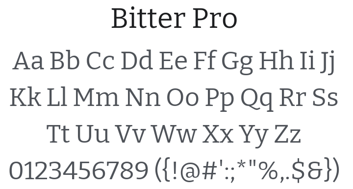
Bitter Pro Font Family
by Sol Matas
21 downloads
License
SIL Open Font License
Uploaded on 3 March, 2026
Styles
18 styles included
-
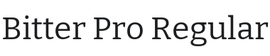
BitterPro-Regular.ttf
-
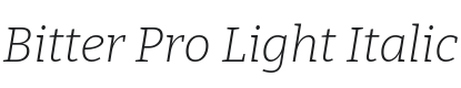
BitterPro-Light.ttf

-
BitterPro-ThinItalic.ttf

-
BitterPro-Thin.ttf

-
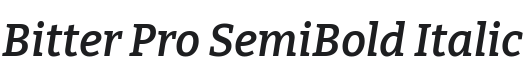
BitterPro-SemiBoldItalic.ttf
-
BitterPro-SemiBold.ttf

-
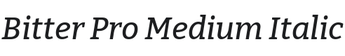
BitterPro-MediumItalic.ttf
-
BitterPro-Medium.ttf

-
BitterPro-LightItalic.ttf
-
BitterPro-Black.ttf

-
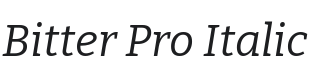
BitterPro-Italic.ttf
-
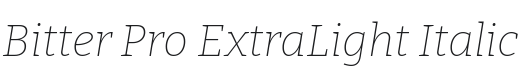
BitterPro-ExtraLightItalic.ttf
-
BitterPro-ExtraLight.ttf

-
BitterPro-ExtraBoldItalic.ttf

-
BitterPro-ExtraBold.ttf

-
BitterPro-BoldItalic.ttf

-
BitterPro-Bold.ttf

-
BitterPro-BlackItalic.ttf

About Bitter Pro
People read and interact with text on screens more and more each day. What happens on screen ends up being more important than what comes out of the printer. With the accelerating popularity of electronic books, type designers are working hard to seek out the ideal designs for reading on screen.
Motivated by her love for the pixel, Sol Matas designed Bitter. A "contemporary" slab serif typeface for text, it is specially designed for comfortably reading on any computer or device. The robust design started from the austerity of the pixel grid, based on rational rather than emotional principles. It combines the large x-heights and legibility of the humanistic tradition with subtle characteristics in the characters that inject a certain rhythm to flowing texts.
Bitter has little variation in stroke weight and the Regular style is thicker than a usual ‘Regular’ style for print design. This generates an intense color in paragraphs, accentuated by the serifs that are as thick as strokes with square terminals.
Each glyph is carefully designed with an excellent curve quality added to the first stage of the design, that was entirely made in a pixel grid. The typeface is balanced and manually spaced to use very few kerning pairs.
Related Categories
Similar Fonts
View All →