Space Grotesk + Space Mono
Live preview — click text to edit
Design with confidence
Great typography pairs a distinctive display face with a body face that stays out of the way. This combination balances character and readability, making it a solid choice for headlines, invitations, and editorial layouts alike.
Color
Heading Font (Weight)
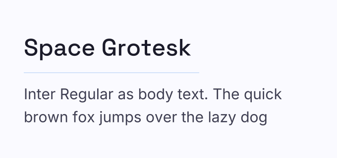
Space Grotesk Bold - 700
Body Font (Weight)
Space Mono Regular - 400
Category
Modern
Size Waterfall
Both fonts at a glance
Space Grotesk Bold · Heading
Grace in every glyph
Grace in every glyph
Grace in every glyph
Grace in every glyph
Space Mono Regular · Body
The quiet strength of a well-set line of body copy
The quiet strength of a well-set line of body copy
The quiet strength of a well-set line of body copy
The quiet strength of a well-set line of body copy
The quiet strength of a well-set line of body copy
The Fonts in This Pair
Why this pairing works
A same-family cross-style pairing — Space Grotesk's characterful headlines meet Space Mono's fixed-width body text for a page that reads as unmistakably technical and modern.
Related Pairings
View All →