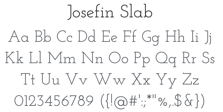
Josefin Slab Font Family
23 downloads
License
SIL Open Font License
Uploaded on 17 January, 2026
Styles
14 styles included
-
JosefinSlab-Regular.otf

-
JosefinSlab-Bold.otf

-
JosefinSlab-BoldItalic.otf

-
JosefinSlab-ExtraLight.otf

-
JosefinSlab-ExtraLightItalic.otf

-
JosefinSlab-Italic.otf

-
JosefinSlab-Light.otf

-
JosefinSlab-LightItalic.otf

-
JosefinSlab-Medium.otf

-
JosefinSlab-MediumItalic.otf

-
JosefinSlab-SemiBold.otf

-
JosefinSlab-SemiBoldItalic.otf

-
JosefinSlab-Thin.otf

-
JosefinSlab-ThinItalic.otf

About Josefin Slab
Josefin Slab was the first typeface–at least in my mind–I designed! But I decided to start simple with Josefin Sans. Following the 1930s trend for geometric typefaces, it just came to me that something between Kabel and Memphis with modern details will look great.
I wanted to stick to the idea of Scandinavian style, so I put a lot of attention to the diacritics, especially to "æ" which has loops connecting in a continuous way, so the "e" slope was determined by this character.
It also has some typewriter style attributes, because I've liked the Letter Gothic typeface since I was in high school, and that's why I decided to make a Slab version of Josefin Sans.
Related Categories
Similar Fonts
View All →