
Lato Font Family

49 downloads
License
SIL Open Font License
Uploaded on 28 February, 2026
Styles
18 styles included
-
Lato-Regular.ttf

-
Lato-Light.ttf

-
Lato-ThinItalic.ttf

-
Lato-Thin.ttf

-
Lato-SemiBoldItalic.ttf

-
Lato-SemiBold.ttf

-
Lato-MediumItalic.ttf

-
Lato-Medium.ttf

-
Lato-LightItalic.ttf

-
Lato-Black.ttf

-
Lato-Italic.ttf

-
Lato-ExtraLightItalic.ttf

-
Lato-ExtraLight.ttf

-
Lato-ExtraBoldItalic.ttf

-
Lato-ExtraBold.ttf

-
Lato-BoldItalic.ttf

-
Lato-Bold.ttf

-
Lato-BlackItalic.ttf

About Lato
Lato means “Summer” in Polish, and it is a sans serif typeface family started in the summer of 2010 by Warsaw-based designer Łukasz Dziedzic. Originally conceived as part of a corporate identity for a large client, the family became available for a public release when they decided to go in different stylistic direction.
Łukasz tried to carefully balance some potentially conflicting priorities in the design; to create a typeface that seems “transparent” when used in body text but also displays original traits in larger size use. Classical proportions, particularly in the uppercase, give the letterforms familiar harmony and elegance, and combine with a sleek treatment that feels contemporary without being trendy. Semi-rounded details feel warm, while the underlying structure provides stability and seriousness. “Serious but friendly, with the feeling of the Summer,” said Łukasz.
Learn more at latofonts.com.
Related Categories
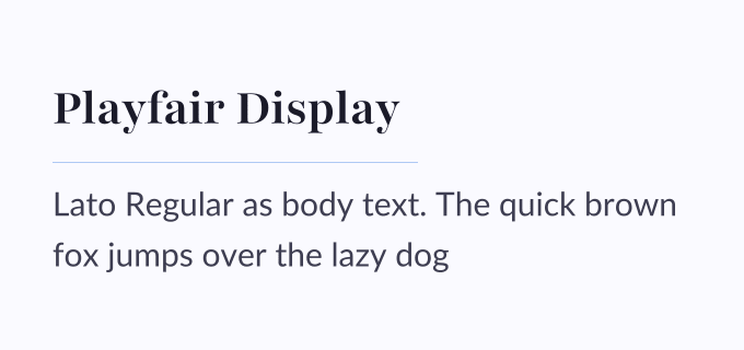
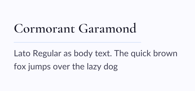
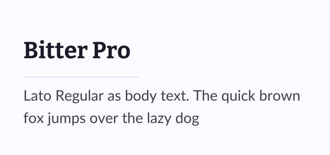
Font Pairings with Lato
Similar Fonts
View All →


