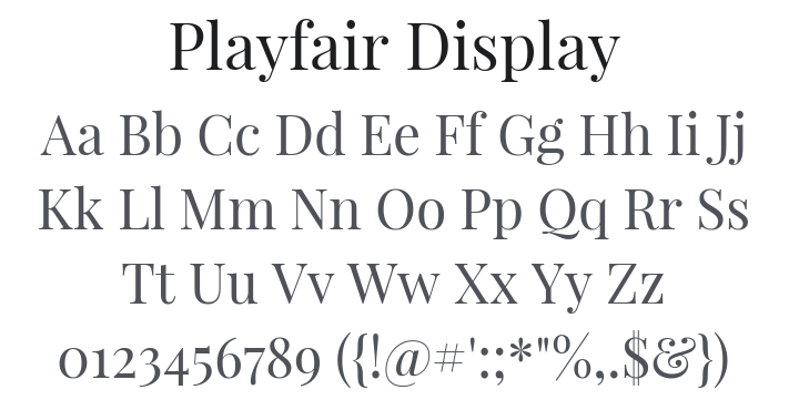
Playfair Display Font Family
112 downloads
License
SIL Open Font License
Uploaded on 9 February, 2026
Styles
6 styles included
-
PlayfairDisplay-Regular.ttf

-
PlayfairDisplay-Bold.ttf

-
PlayfairDisplay-BlackItalic.ttf

-
PlayfairDisplay-BoldItalic.ttf

-
PlayfairDisplay-Italic.ttf

-
PlayfairDisplay-Black.ttf

About Playfair Display
Playfair is a transitional design. In the European Enlightenment in the late 18th century, broad nib quills were replaced by pointed steel pens as the popular writing tool of the day. Together with developments in printing technology, ink, and paper making, it became fashionable to print letterforms of high contrast and delicate hairlines that were increasingly detached from the written letterforms. This design lends itself to this period, and while it is not a revival of any particular design, it takes influence from the designs of John Baskerville and from ‘Scotch Roman’ designs.
This is the main family, with a sibling Playfair Display SC (small caps family).
Similar Fonts
View All →