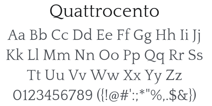
Quattrocento Font Family
Download Free
27 downloads
License
Free for Commercial Use
SIL Open Font License
Uploaded on 26 December, 2025
Styles
2 styles included
-
Quattrocento-Regular.ttf

-
Quattrocento-Bold.ttf

About Quattrocento
Classic, elegant, sober and strong, the Quattrocento typeface has wide and open letterforms. The generous x-height makes it very legible for body text at small sizes, while the tiny details can only be seen at larger sizes mean it is also a great choice for display typography.
Some of their distinctive characteristics are:
- Low Contrast. The thins are just a tad thiner than the thicks, almost monotone.
- Cupped, tapered stems that flows naturally into the serifs.
- Distinctive K, R and & tail.
- Cupped B, D, E, F, P, Q, R and T.
- The Q is a humble expression of admiration and gratitude for Doyald Young.
- Alternate M, Two W alternates.
- Narrow L, T for better fit.
- Almost flat top serif on the lowercases.
- Shoulders of the m and n rise above the serif.
- Serif-less bottom j and y.
It's the perfect sans-serif companion for Quattrocento Sans.
Related Categories
Similar Fonts
View All →