
Transitional Fonts
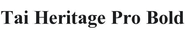
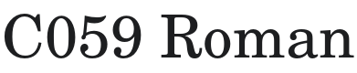
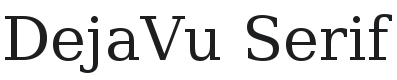
Transitional serifs sit between the warmth of Old Style and the sharpness of Didone. More upright, more contrast, and highly legible — they work equally well in print and on screen.
Transitional Fonts
Showing 1 – 20 of 78 Fonts
-
4 styles

-
2 styles
-
1 style

-
16 styles

-
8 styles

-
10 styles

-
2 styles

-
8 styles

-
4 styles

-
42 styles

-
4 styles

-
4 styles
-
1 style

-
4 styles

-
3 styles

-
12 styles

-
6 styles

-
8 styles
-
1 style

-
1 style

Page 1 of 4